Yesterday, Brad Frost (@brad_frost) presented on Atomic Design at An Event Apart: Chicago 2013. Brad's blog post and slide deck (video) from Beyond Tellerrand do a better job explaining the overall concept than I ever could. That said, I did want to touch on the recent changes that we made to his tool, Pattern Lab, to help designers and developers take advantage of Atomic Design. You can check out a simple demo of the front-end of the tool and take a peek at the code on GitHub. There is also an expanded set of documentation for the project.

PHP Shouldn't Be a Requirement

One of the overriding goals with the re-write of Brad's original version of Pattern Lab was to make sure the new edition wasn't tied to any particular "server-side" language. The new edition breaks up Pattern Lab into four parts:

  • Mustache-based patterns & templates,
  • JSON-based dynamic data,
  • an HTML, CSS, and Javascript-based viewport resizer, and
  • a PHP-based static website builder

This strong separation should make it easier to share agnostic resources like patterns, data, & the viewport resizer amongst several different libraries. It should even be possible to convert patterns into other template languages like Liquid or Kit so they work with other tools.

Do you prefer node.js to PHP? Who, other than me, doesn't, right? Take the patterns, data, and viewport resizer and mash it up with your own builder. Ruby? Do the same. Outside of making sure that patterns are compiled properly with the data we want to see what people can come up with to make Pattern Lab better.

Once you have your take on Pattern Lab done please share by submitting an issue. Maybe we'll even include it in the official Pattern Lab GitHub organization.

Plusses & Minuses to Strong Separation

There are some nice upsides to this strong separation as another goal was to limit dependencies and installation of software as much as possible. You don't need to run Apache locally to make this all work. Got PHP? You're all set. Just use the "Open File..." dialog in your browser and open the vanilla index.html. Also, the final product can be pushed anywhere for review by clients.

There are some downsides too. The new edition can feel a little indirect at first and the need to regenerate a site after changes feels like extra work. Pro tip: use the watcher to auto-regenerate your site when you make a change and use the auto-reload server to automatically reload your site when your site is regenerated. If you use CodeKit you'll want to turn-off its auto-refresh feature when using Pattern Lab.

Don't Like the Atomic Metaphors? Nuke 'em

By default, Pattern Lab uses science-y metaphors but you can rename and reorganize your patterns anyway you see fit. We're not trying to lock you into any particular way of thinking about your assets. You can put them together however you see fit. Just rename directories, update your Mustache patterns, regenerate the website, and, bingo bango, your edition of Pattern Lab will be updated. Atoms, molecules, and organisms are definitely not required though it might take a little work to update the patterns.

Related to that, do you want to use Bootstrap/Zurb, Zepto/jQuery or Sass/LESS for your site? Have at it. Pattern Lab makes no distinction between libraries you may want to use. For assets that will be referenced in your site just put them in the _source directory and update the pattern header & footer in _source/_patternlab-files/ so the assets are included when your patterns load. The docs go into more depth regarding patterns and assets.

We're Not Done

There are a few features that have yet to be implemented in Pattern Lab:

  • Annotations: one of the use cases for Pattern Lab is to share work with clients so they can review it. Annotations will offer you a way to explain the design decisions you made directly in Pattern Lab.
  • Custom Viewport Sizes in the Toolbar: Brad can come up with a fancy name for this feature but it's based on the "Phases" proposal from Ben Edwards. Because one of the goals of Pattern Lab is to be tool independent the final implementation will be based on parsing CSS but I think it'll be really useful.
  • Regenerate from the UI: Because Pattern Lab is, ultimately, a static site generator that means it takes user action to regenerate the Pattern Lab site to see changes. Currently, this means either using the command-line options or double-clicking a file on the Mac. We'd like to have a UI element that can make updates easier.

These are in a addition to a number of UI and under-the-hood tweaks that we still want to make.

We Want Your Feedback

Ultimately, we want to hear from you. What works and what doesn't work for you when using Pattern Lab? Got an idea like Ben's? Share it and we'll see if we can make it work. Run into any problems? Let us know. Use Pattern Lab internally or with client work? We're always curious to hear about real-world use. Just drop an issue for us and we'll respond.
This article was posted

On Tuesday, April 16, 2013, I was lucky enough to give the opening talk on the web performance day of RWD Summit presented by Environments for Humans. This is the short description for the talk:

Today, a web page can be delivered to desktop computers, televisions, or handheld devices like tablets or phones. While a technique like responsive design helps ensure that our web sites look good across that spectrum of devices we may forget that we need to make sure that our web sites also perform well across that same spectrum. More and more of our users are shifting their Internet usage to these more varied platforms and connection speeds with some moving entirely to mobile Internet.

In this session we’ll look at the tools that can help you understand, measure and improve the web performance of your web sites and applications. The talk will also discuss how new server-side techniques might help us optimize our front-end performance. Finally, since the best way to test is to have devices in your hand, we’ll discuss some tips for getting your hands on them cheaply.

This presentation builds upon Dave's "Optimization for Mobile" chapter in Smashing Magazine's "The Mobile Book."

So here is the deck embedded into the post for your convenience:

Questions about the deck? Want me to give this talk at your conference or meet-up? Check out my contact info or hit me up at @dmolsen on Twitter.

This article was posted

My last few projects for West Virginia University have been super simple. In order to keep the back-end management of the projects simple as well I've started writing command line interfaces as opposed to web-based ones. My interest in using command line tools is based on the work I did with the PHP library for ua-parser. For that project I wanted to give developers a simple way to cron out updates to the regexes.yaml file. It seemed natural for me to take that experience and use it in my day-to-day work.

The Benefits of Moving to the Command Line

Moving to command line interfaces for these projects has given me four wins:

  • A lot less code. Authentication code? Gone. Templates? Nuked. SSL-enabled hostnames? Don't have to worry about it. All of the cruft that is needed to host a secure admin web interface doesn't have to be written. It's faster to get up and running as well as faster to modify.
  • Simpler security. The security model now becomes one of access to the server and file. The important caveat here being that your command line utility should be outside of the document root for your website.
  • Better documentation. Because the interface consists of flags (e.g. -f) I have to make sure I provide help documentation in case anyone else needs to use them. It also helps me since I forget them after a while too. The makes for a better solution all around.
  • Cron-friendly. Because the interfaces are written to be accessed and report to the command line it makes it very easy to cron reports and functionality (e.g. getting an updated file from a remote server each day)

The Downside to Moving to the Command Line

"But," you might ask, "don't you become a bottleneck for administering these projects?" I think the natural assumption is that now I can't easily hand off responsibility to anyone else. My experience in the past has been that clients won't, for the most part, take responsibility if they can avoid it anyway. Regardless, the people who would need to pick up the project all have access to the servers so no one is actually locked out. Also, with the documentation built-in hopefully it's straightforward for them to address any issues.

That said, if you're the one and only one who has access to the server or you keep the tool local then, yes, you will be a bottleneck. Understand if the trade-off is worth it.

A Simple Command Line Utility Example Written in PHP

The following is a simple example of what a command line tool might look like if it were built with PHP. By the way, this is one place where I think PHP really excels but lots of frameworks come with similar tools. You could also make your command line tool even more interactive (e.g. ask yes/no questions or similar) but I didn't cover that in the example. See the example on GitHub.

This article was posted

One of the hotter social networks in higher education is Instagram. As a developer you might find yourself needing to pull photos into a website using Instagram's API like we did when we recently added Instagram photos to our central social networking website, Connect with WVU. As with many APIs Instagram requires authentication to access many of its end-points. This is fine but unfortunately the service makes the assumption that you are going to access the end-points on behalf of a particular user that has had the opportunity to give an application permission to access their information. This isn't always the case. Especially when you simply want to access the service to pull your own user's information via a small script.

Our Set-up

In our situation we have a social network data collection service that queries the Instagram API every 10 minutes to get the latest photos that have been posted to our WestVirginiaU account. The info is saved to a SQLite database. When users hit connect.wvu.edu a request is made to this service to retrieve the latest information (along with Facebook, Twitter, Google+, YouTube and foursquare data) from the SQLite database.

The trick is that the service simply needs to make requests as the primary account but has no way to login to authenticate and get an an access token for Instagram. A service like Twitter gets this particular use case correct in that they allow you to generate an access token via their developer admin. Instagram doesn't have this feature yet. Hopefully they add it. For now you can do the following.

Generating an Access Token for Instagram

Generating a token to be used in your application is actually fairly straightforward once you know the magical incantation. Just do the following:

  1. Write down the client ID, client secret, and redirect URI for the client you want to generate an access token for. You can find it on the "Manage Clients" panel in the Instagram Developer's site.
  2. Visit the following address replacing the client ID and the redirect URI:
  3. When prompted choose "Yes" to authorize the app
  4. You'll be redirected to the redirect URI you supplied. At the end of the address you'll see a request variable called code. Copy the value.
  5. Open Terminal (or favorite command line tool). Copy and paste the following. Replace the appropriate values:
  6. Copy the access token from the returned JSON object.

It should also be noted that the generated access token can still expire. It shouldn't expire in the near-term but it's not permanent.

This article was posted

This post is a follow-up to Lessons Learned Building the New dmolsen.com: Static, A Performance Budget, Sass & SVG. The previous post focused on my technical choices in the re-design of dmolsen.com. This post focuses on my design choices.

I had two popular quotes floating around in my head as I moved my design for the new dmolsen.com from the sketchpad to the browser. The first quote was from Bryan Rieger (@bryanrieger):

The second quote was from Stephen Hay (@stephenhay) (sorry, I could only find Brad's version of the quote):

These two quotes led to the foundational design concepts that guided the implementation of the new layout. The first concept, that the site should work without media queries, was surprisingly natural to implement. The second concept, that content alone would determine the layout's breakpoints, has had a much larger influence on me than I expected. Both with regards to this particular layout as well as in how I think about and approach responsive design in general.

Media Query-less Design

It's become the norm to approach responsive design from a "mobile layout first" perspective. Essentially, your base styles should be the mobile ones and then you should work your way "up" towards desktop screen sizes via the use of media queries that incorporate min-width rules. I would argue that instead we should be working from the base styles for a design and then only use media queries to tweak those base styles at breakpoints. This leads to an easy-to-understand progression of styles that either build on each other or only slightly modify each other. A small, Sass-ified example of this from my new layout:

For me this was a much more straightforward way of looking at my layout decisions. It's all the same layout regardless of viewport size but their may be some simple and minor variations.

The other benefit of this style is that the media query itself becomes a feature test by separating those browsers that might understand certain CSS properties versus older browsers that might not. So older IE support was essentially baked in based on approaching the whole layout as "media query-less". IE and similar browsers have a layout that works but we can still use "cooler" CSS features without much fuss. Yes, Virginia, this is progressive enhancement. It did highlight one area where min-width based queries might not be usable though and that's navigation.

I made liberal use of nth-child() in the CSS for my navigation on smaller screen sizes. IE would choke on this so this is one area where I ended up using a media query with max-width. So in this case the larger screen styles are set to the default and then pared down based on breakpoint.

Admittedly, I'm working with a really simple two-column layout so my CSS should never get all that crazy. Even two-columns can cause their own issues when we decide to set breakpoints based on content though.

Content-based Breakpoints

For such a simple concept this decision was a surprisingly scary one to me. By their very nature fluid layouts mean that we must give up a certain amount of control but implementing breakpoints based on device width returns a certain level of comfort or certainty. You can say to yourself:

I'm totally not going to use device detection but if I set my breakpoint at 768px my site will look like this on an iPad. No worries.

Trusting that your content will just happen to look acceptable everywhere based on simply flexing a browser window, marking breakpoints, and then using ems (not even px) to describe breakpoints... I had some trepidation to say the least.

At the end of the process I found content-based breakpoints to be surprisingly liberating for three reasons:

  • One simple rule to decide breakpoints: line length. Line length look a little short or long? Breakpoint. Otherwise things are kosher. There's even a Golden Ratio Typography Calculator though I didn't use it.
  • Layout moves away from being fixed and focused at the page level and instead one must think in containers and sub-containers. This leads to a lot of minor but important optimizations which seem to be picking up the name "tweakpoints."
  • Testing became sort of a joke because the final layouts seemed to Just Work™. Again, the caveats being that this is a simple layout and I had already employed my 50K budget so I didn't have to worry that much about performance.

The move from thinking about an overall layout to thinking about containers and sub-containers and their related tweakpoints is one of my more exciting take-aways from this project.

Tweakpoints

I'm not the first to hit on this but I'm glad the issue seems to be picking up ink these last few weeks. It's such a natural progression of the process. Mark Boulton (@markboulton), Ben Callahan (@bencallahan), and Jeremy Keith (@adactio) expand on this idea better than I can with The In-Between, [There is No Breakpoint](http://seesparkbox.com/foundry/thereisnobreakpoint), and _Tweakpoints respectively.

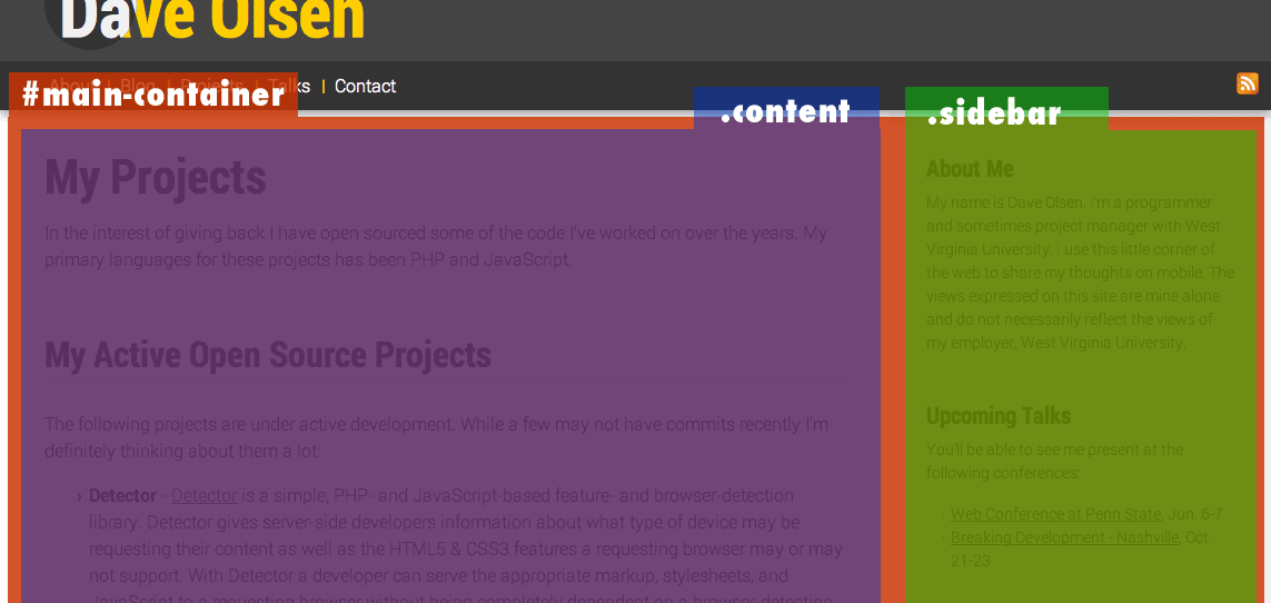
I'd like to highlight the primary example in which tweakpoints, or at least what I'm thinking of as tweakpoints, are used in this layout. The primary container for the page, #main-container, has one breakpoint at 52.5em. Below that breakpoint the layout for the container is a single column and above that it's two column.

Showing the container positions

The decision to break is driven primarily by the line length for the .sidebar container. Once the length gets too short I drop it below .content. Within the .sidebar container though we have another layout decision. Now that the width is set to 100% the line length is too long and the image of the book awkwardly floats in a sea of grey.

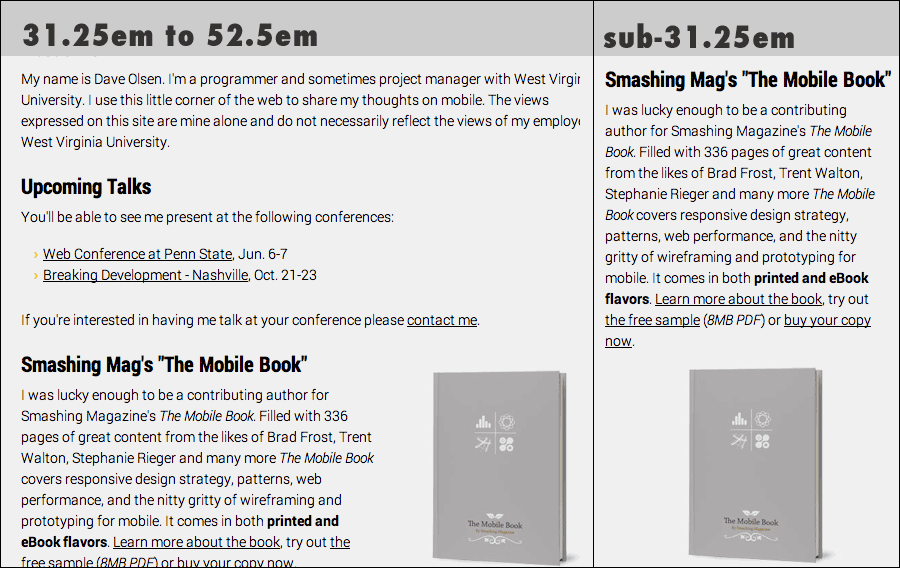
I couldn't do a ton about the overall line length but I could address the image. This, to me, is a tweakpoint. I'm addressing a minor issue with a sub-container and tweaking the layout of content in that container only. In this case, the paragraph containing the book text gets floated left and the book image gets floated right. This only works for so long though. The line length gets too short again for the book text. Once that happens the sub-container is tweaked again and the text is again stacked at 31.25em.

Comparison of book layout on small and medium viewports

Wrapping It Up

As I've said a few times, this isn't the most complicated layout on the planet but I do think some of the lessons learned here will help me as I tackle more complicated responsive projects. Content-driven layout can be quite the rabbit hole but I think the more you tweak simply based on a squishy browser window the less testing for specific devices you'll need. You can feel a little better that your content will go and flow in a predictable and usable fashion.

This article was posted