This post is a follow-up to Lessons Learned Building the New dmolsen.com: Static, A Performance Budget, Sass & SVG. The previous post focused on my technical choices in the re-design of dmolsen.com. This post focuses on my design choices.
I had two popular quotes floating around in my head as I moved my design for the new dmolsen.com from the sketchpad to the browser. The first quote was from Bryan Rieger (@bryanrieger):
@zomigi the first media query is actually the absence of support for media queries.
— Bryan Rieger (@bryanrieger) December 1, 2011
The second quote was from Stephen Hay (@stephenhay) (sorry, I could only find Brad's version of the quote):
start with the small screen first, then expand until it looks like shit. TIME FOR A BREAKPOINT! @stephenhay #bdconf
— Brad Frost (@brad_frost) April 16, 2012
These two quotes led to the foundational design concepts that guided the implementation of the new layout. The first concept, that the site should work without media queries, was surprisingly natural to implement. The second concept, that content alone would determine the layout's breakpoints, has had a much larger influence on me than I expected. Both with regards to this particular layout as well as in how I think about and approach responsive design in general.
Media Query-less Design
It's become the norm to approach responsive design from a "mobile layout first" perspective. Essentially, your base styles should be the mobile ones and then you should work your way "up" towards desktop screen sizes via the use of media queries that incorporate min-width rules.
I would argue that instead we should be working from the base styles for a design and then only use media queries to tweak those base styles at breakpoints. This leads to an easy-to-understand progression of styles that either build on each other or only slightly modify each other. A small, Sass-ified example of this from my new layout:
For me this was a much more straightforward way of looking at my layout decisions. It's all the same layout regardless of viewport size but their may be some simple and minor variations.
The other benefit of this style is that the media query itself becomes a feature test by separating those browsers that might understand certain CSS properties versus older browsers that might not. So older IE support was essentially baked in based on approaching the whole layout as "media query-less". IE and similar browsers have a layout that works but we can still use "cooler" CSS features without much fuss. Yes, Virginia, this is progressive enhancement. It did highlight one area where min-width based queries might not be usable though and that's navigation.
I made liberal use of nth-child() in the CSS for my navigation on smaller screen sizes. IE would choke on this so this is one area where I ended up using a media query with max-width. So in this case the larger screen styles are set to the default and then pared down based on breakpoint.
Admittedly, I'm working with a really simple two-column layout so my CSS should never get all that crazy. Even two-columns can cause their own issues when we decide to set breakpoints based on content though.
Content-based Breakpoints
For such a simple concept this decision was a surprisingly scary one to me. By their very nature fluid layouts mean that we must give up a certain amount of control but implementing breakpoints based on device width returns a certain level of comfort or certainty. You can say to yourself:
I'm totally not going to use device detection but if I set my breakpoint at 768px my site will look like this on an iPad. No worries.
Trusting that your content will just happen to look acceptable everywhere based on simply flexing a browser window, marking breakpoints, and then using ems (not even px) to describe breakpoints... I had some trepidation to say the least.
At the end of the process I found content-based breakpoints to be surprisingly liberating for three reasons:
- One simple rule to decide breakpoints: line length. Line length look a little short or long? Breakpoint. Otherwise things are kosher. There's even a Golden Ratio Typography Calculator though I didn't use it.
- Layout moves away from being fixed and focused at the page level and instead one must think in containers and sub-containers. This leads to a lot of minor but important optimizations which seem to be picking up the name "tweakpoints."
- Testing became sort of a joke because the final layouts seemed to Just Work™. Again, the caveats being that this is a simple layout and I had already employed my 50K budget so I didn't have to worry that much about performance.
The move from thinking about an overall layout to thinking about containers and sub-containers and their related tweakpoints is one of my more exciting take-aways from this project.
Tweakpoints
I'm not the first to hit on this but I'm glad the issue seems to be picking up ink these last few weeks. It's such a natural progression of the process. Mark Boulton (@markboulton), Ben Callahan (@bencallahan), and Jeremy Keith (@adactio) expand on this idea better than I can with The In-Between, [There is No Breakpoint](http://seesparkbox.com/foundry/thereisnobreakpoint), and _Tweakpoints respectively.
I'd like to highlight the primary example in which tweakpoints, or at least what I'm thinking of as tweakpoints, are used in this layout. The primary container for the page, #main-container, has one breakpoint at 52.5em. Below that breakpoint the layout for the container is a single column and above that it's two column.
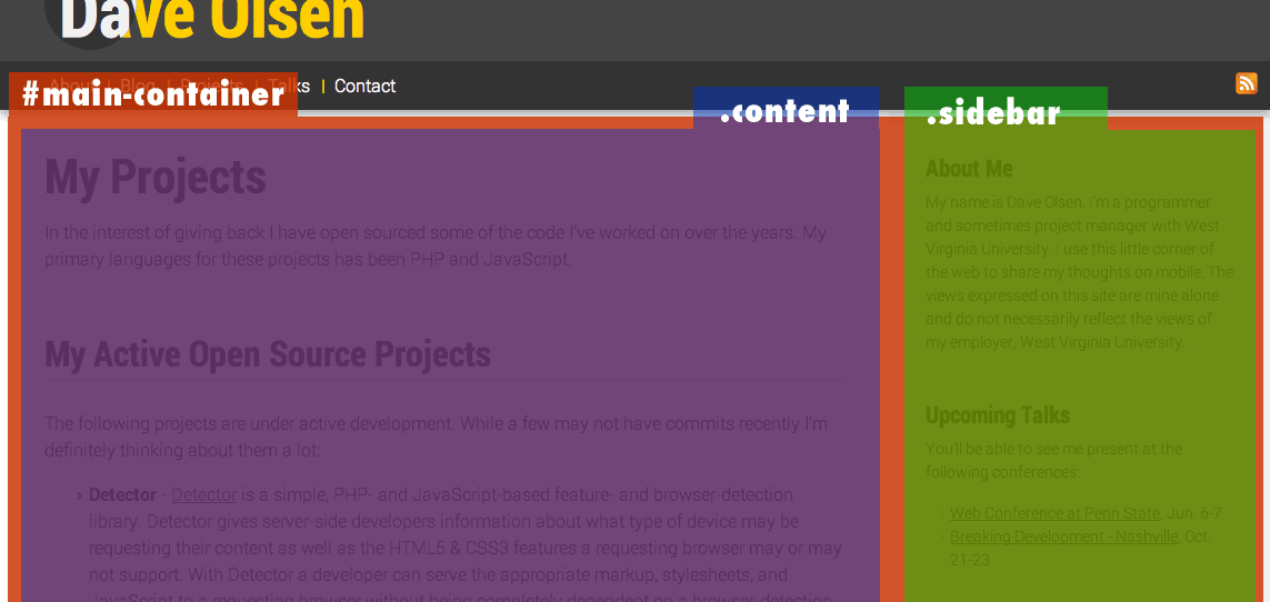
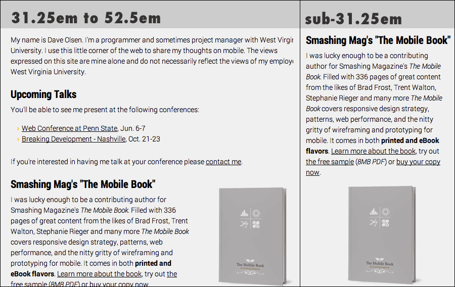
The decision to break is driven primarily by the line length for the .sidebar container. Once the length gets too short I drop it below .content. Within the .sidebar container though we have another layout decision. Now that the width is set to 100% the line length is too long and the image of the book awkwardly floats in a sea of grey.
I couldn't do a ton about the overall line length but I could address the image. This, to me, is a tweakpoint. I'm addressing a minor issue with a sub-container and tweaking the layout of content in that container only. In this case, the paragraph containing the book text gets floated left and the book image gets floated right. This only works for so long though. The line length gets too short again for the book text. Once that happens the sub-container is tweaked again and the text is again stacked at 31.25em.
Wrapping It Up
As I've said a few times, this isn't the most complicated layout on the planet but I do think some of the lessons learned here will help me as I tackle more complicated responsive projects. Content-driven layout can be quite the rabbit hole but I think the more you tweak simply based on a squishy browser window the less testing for specific devices you'll need. You can feel a little better that your content will go and flow in a predictable and usable fashion.