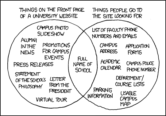
Ah, the infamous University Website comic from xkcd. I saw this posted in a forum last week and as I was looking at the right side of the Venn diagram I thought, "That looks like a lot of the current and planned content for our mobile site." I think the only thing we don't have are the admissions application. And that thought got me to thinking about Luke Wroblewski's (@lukew) concept of Mobile First. The key point to me, and how it relates to the Venn diagram, is that by designing mobile first you have to "focus on only the most important data and actions* in an application*." This focus, by removing unnecessary fluff and cruft to fit in the constraints of both the device real estate as well as network limitations, helps craft a better and more useful user experience. I think it's a really interesting way to approach design and maybe we need more of that in higher ed. Mobile sites in higher ed will probably reflect more closely the needs of most of the current student population than the university home pages will… and sadly those sites will be buried. Will university mobile sites one day grow up and be the portals to information that students have always said they wanted on the desktop?
Note: I'm well aware of the political and audience issues affecting university home pages having been through the redesign process two times now. A boy can dream though.